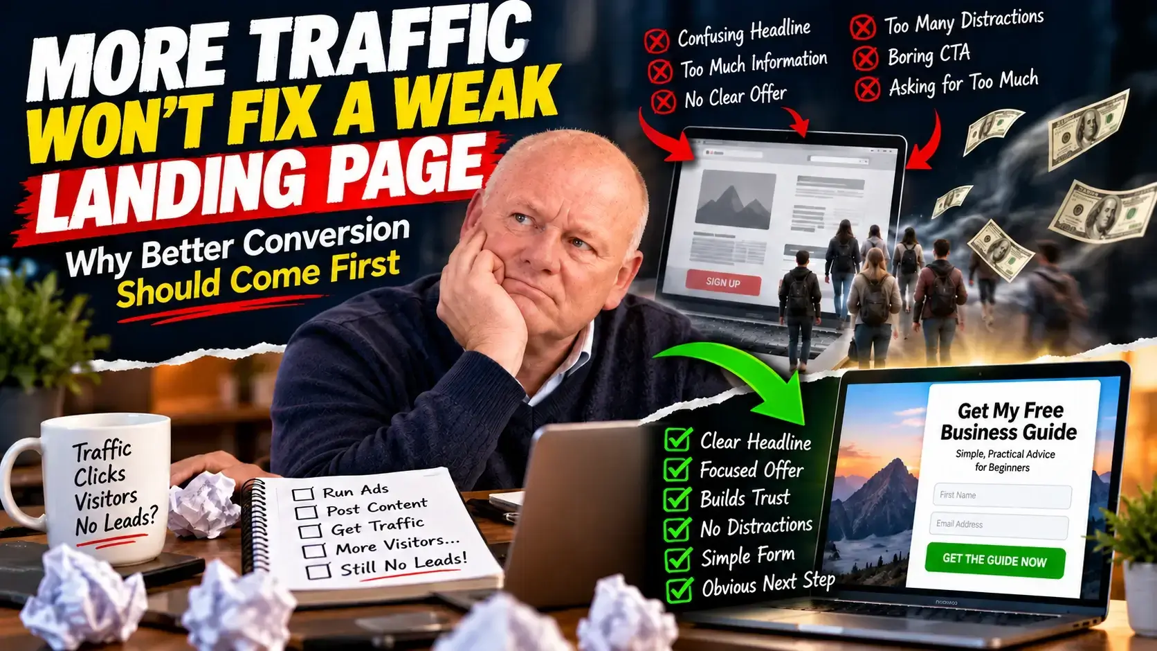
More Traffic or a Better Landing Page? Fix This First
There is an expensive mistake people make in online business without even realising they are making it.
They assume the answer to poor results is more traffic.
More visitors.
More clicks.
More ads.
More posts.
More money spent trying to get people onto the website.
But if the page those people land on is confusing, weak, cluttered or badly matched to what they expected to see, more traffic can simply mean more people leaving faster.
That is the part that hurts.
You can work harder, spend more and still end up with very little to show for it.
The problem may not be your traffic at all.
It may be the page receiving it.
The Painful Truth About Traffic
Traffic feels productive because you can see it.
You can see clicks.
You can see impressions.
You can see visitors arriving.
Those numbers can make you feel like something is happening.
But traffic is only the beginning.
A visitor is not automatically a lead.
A click is not automatically a sale.
An impression is not automatically interest.
If the page does not make sense quickly, people disappear.
And most of them will never tell you why.
They will not send you a message saying:
“Your headline confused me.”
“I couldn’t work out what I was getting.”
“There were too many things competing for my attention.”
“I didn’t trust the page enough to enter my email address.”
They just leave.
That is what makes landing-page problems so dangerous.
The page can be failing quietly while everything looks technically fine.
You Could Be Paying to Send People Away
Imagine putting money into traffic every day.
Your ad works.
Your social post gets attention.
Your email gets the click.
Someone reaches your page.
Then the page loses them.
Maybe the headline is vague.
Maybe they have to scroll too far to understand the offer.
Maybe there are three buttons asking them to do three different things.
Maybe the form looks like too much effort.
Maybe the page feels like it was written for everybody and therefore speaks clearly to nobody.
The traffic did its job.
The page didn’t.
That distinction matters because otherwise you can spend weeks trying to fix the wrong problem.
Before You Buy More Traffic, Ask This
Before spending another pound, dollar or minute trying to attract more visitors, ask:
If the right person arrived on this page right now, would they immediately understand why they should care?
That one question can reveal a lot.
A strong landing page should not make people work hard to understand it.
People should not need to study your page.
They should not need to decode clever copy.
They should not need to hunt for the next step.
The page should do the thinking for them.
The Five-Second Test
Look at your landing page as if you have never seen it before.
Give yourself a few seconds.
Can you answer these three questions immediately?
- What is this?
- Is this for me?
- What should I do next?
If any of those answers are unclear, the page probably needs work.
That is especially important for people coming from ads, social media or search.
They do not arrive with unlimited patience.
They arrive with a question.
Your job is to answer it quickly.
Problem 1: Your Headline Is Too Vague
A headline can look impressive and still communicate almost nothing.
For example:
“Transform Your Future Today”
Sounds positive.
But transform what?
Your health?
Your business?
Your finances?
Your website?
A visitor should not have to guess.
A better headline usually tells them either:
what they will get
or
what problem you are helping them solve.
Clarity usually beats cleverness.
Problem 2: You Are Trying to Say Too Much
This is one of the easiest mistakes to make.
You want the page to sound convincing, so you keep adding things.
More benefits.
More explanation.
More testimonials.
More buttons.
More sections.
More graphics.
Eventually the page becomes harder to understand, not easier.
Good landing pages are often strong because of what they leave out.
Every extra element should earn its place.
Ask:
Does this help somebody make the decision?
If not, it may simply be adding noise.
Problem 3: The Offer Is Not Clear Enough
Never assume people understand what they are getting.
Spell it out.
If somebody enters their email address, what happens next?
Do they get a guide?
A checklist?
A video?
A consultation?
A newsletter?
A discount?
The clearer the exchange, the easier the decision becomes.
Confusion creates hesitation.
Hesitation creates exits.
Problem 4: Your Page Has Too Many Choices
One of the simplest ways to weaken a landing page is to give visitors too many things to do.
Visit the blog.
Follow on Facebook.
Watch a video.
Read another article.
Join the mailing list.
Check another offer.
Click here.
Click there.
Every extra choice creates another possible exit.
If the purpose of the page is lead generation, the page should make that next step obvious.
One page. One job. One main action.
Problem 5: Your Call to Action Is Hiding
If the visitor has to search for the button, something is wrong.
Your call to action should be easy to find and easy to understand.
Weak calls to action often use vague language.
“Submit”
“Continue”
“Learn More”
Sometimes those words are fine.
But when possible, make the action more specific.
“Get the Guide”
“Send Me the Checklist”
“Show Me the Next Step”
The visitor should know what will happen after they click.
Problem 6: You Are Asking for Too Much
Every form field creates a small amount of friction.
Name.
Email.
Phone number.
Company.
Website.
Job title.
Annual revenue.
Business size.
You may want all that information.
But does the visitor need to give it to you right now?
If the purpose of the page is simply to deliver a guide or start a conversation, asking for too much can make the exchange feel unbalanced.
Ask only for what you genuinely need at that stage.
Problem 7: Your Page Does Not Match the Traffic
This is a big one.
You could have a beautifully designed landing page and still get poor results if the message does not match why the visitor clicked.
Imagine someone clicks an ad promising:
“A beginner’s guide to getting your first email subscribers.”
Then the landing page immediately starts talking about advanced automation, scaling campaigns and enterprise marketing tools.
The visitor may wonder whether they have reached the wrong page.
The promise that earned the click should continue on the landing page.
Same problem. Same audience. Same expectation.
Problem 8: You Are Trying to Impress Instead of Reassure
Some landing pages feel as though they are trying desperately to prove how clever the business is.
Buzzwords.
Huge claims.
Technical language.
Over-the-top promises.
But visitors are often asking much simpler questions.
Can I trust this?
Is it really for me?
What am I agreeing to?
What happens next?
Will this actually help?
Answer those questions.
Trust can often improve when the page feels more straightforward and less theatrical.
Problem 9: Your Page Looks Fine on Desktop but Fails on Mobile
This can quietly destroy results.
The desktop version looks perfect.
But on a phone:
the headline wraps badly,
the button disappears below the fold,
the form is awkward,
the text becomes too small,
or something overlaps.
Always look at the page on an actual phone.
Do not assume the desktop preview tells you everything.
Problem 10: You Keep Changing Everything at Once
Another common mistake is redesigning the whole page after a disappointing result.
Headline changed.
Button changed.
Image changed.
Form changed.
Copy changed.
Offer changed.
Now if the page improves, you do not really know why.
And if it gets worse, you do not know which change caused the problem.
When possible, improve one important thing at a time.
Learn from the result.
Then make the next decision.
Traffic and Conversion Work Together
This does not mean traffic is unimportant.
You obviously need visitors.
But traffic and conversion are two different jobs.
Traffic gets people to the page.
Conversion helps the right people take the next step.
Pouring more traffic onto a weak page can simply magnify the weakness.
Improving the page first gives future traffic a better chance of doing something useful.
A Simple Landing Page Checklist
Before sending more traffic, check the following:
- Is the headline immediately understandable?
- Does the page clearly explain who it is for?
- Does the visitor understand what they will receive?
- Is the value obvious without reading every word?
- Is there one clear primary action?
- Is the form simple?
- Are unnecessary distractions removed?
- Does the page match the message that brought the visitor there?
- Does the page work properly on mobile?
- Have you tested the full process yourself?
Test the Entire Journey Yourself
This sounds obvious.
But do it.
Open the page.
Enter your own details.
Click the button.
Check the confirmation page.
Check the email.
Click the link in the email.
Check where it goes.
Look for anything confusing.
You may be surprised by what you find.
A form can technically work and still create a poor experience.
The Question Most People Ask Too Late
People often ask:
“How can I get more traffic?”
But sometimes the better question is:
“What happens to the traffic I already have?”
That can be far more revealing.
If people arrive and leave immediately, adding more visitors may not solve the underlying issue.
If visitors understand the page but still do not act, the offer may need work.
If they start the form but do not finish, the form may be creating friction.
If they subscribe but never open the email, the problem has moved further down the journey.
Each stage tells you something different.
Don’t Just Ask Whether the Page Looks Good
This is important.
A landing page is not a piece of artwork.
It has a job.
The real question is not:
“Do I like the design?”
The question is:
“Does the page help the right visitor understand the offer and take the next sensible step?”
Those are not the same thing.
Better Conversion Can Make Everything Else Work Harder
A better landing page can improve the value of the traffic you already generate.
The same Facebook post may become more useful.
The same ad may produce more leads.
The same email click may produce more subscribers.
The same blog visitor may be more likely to take the next step.
You are not necessarily working harder.
You are helping more of the existing attention turn into something useful.
Before You Spend More, Fix the Leaks
If your first instinct is to buy more traffic, stop for a moment.
Look at the landing page.
Look at the headline.
Look at the offer.
Look at the form.
Look at the call to action.
Look at the mobile version.
Look at what happens after somebody submits their details.
Ask yourself:
Where could somebody become confused, uncertain or distracted?
Fix that first.
More Traffic or a Better Page?
Sometimes you genuinely need more traffic.
But sometimes you already have enough traffic to learn something.
You just need to pay closer attention to what happens after people arrive.
The lesson is simple:
Do not automatically assume poor results mean you need more visitors.
You may need a clearer message.
A stronger offer.
Less clutter.
A simpler form.
A more obvious next step.
A better match between the traffic and the page.
Because more traffic does not automatically create more leads.
Better conversion gives the traffic you already have a better chance to work.
One Final Question
Open your own landing page now.
Pretend you know absolutely nothing about your business.
Give yourself five seconds.
Then ask:
Do I immediately know what this is, why it matters, and what I should do next?
If the answer is no, that is where I would start.
Better conversion first. More traffic second.